 Xiaoming's Blog
A quick glance at AppWidget
Ever since the first beta release of my podcast app miaocast users have requested that I add support for widgets, which would allow quick playback control. After finishing up v2024.4, I decided to tackle widgets next.
Since miaocast is fully built with Compose and Google has been promoting Glance as the recommended way to build widgets with Compose, naturally I’ve decided to give it a try.
Glance and its limitations
Going in I had thought that I can take full advantage of Compose, which turns out to be quiet wrong. Just like in view world, under the hood app widgets are still limited to what can be achieved with RemoteViews.
Glance, at a higher level is a like a translator that translates your Compose UI written in kotlin into RemoteViews. Since Glance only utlizes the Compose compiler layer to emit nodes that gets turned into RemoteViews, it does not include any of the familar tools one would use on a day to day basis such as Row, Column or even Layout, let alone hight components from the material library.
Glance does has its own implementation of Row, Column and Box, but comparing to their counter parts in regular Compose, a lot of functionalities are missing. For example, there are no Alignment that allows you to space things around inside a Row or Column, no support for Modifier.weight to control the space distribution etc.
I do not have any experience in builing widgets with views, so can’t say if Glance is better than good old views in this case. Since I have no plan to go back to using views as part of this project, I’ve decided to stick with Glance even with all those limitations.
Building the Widget UI
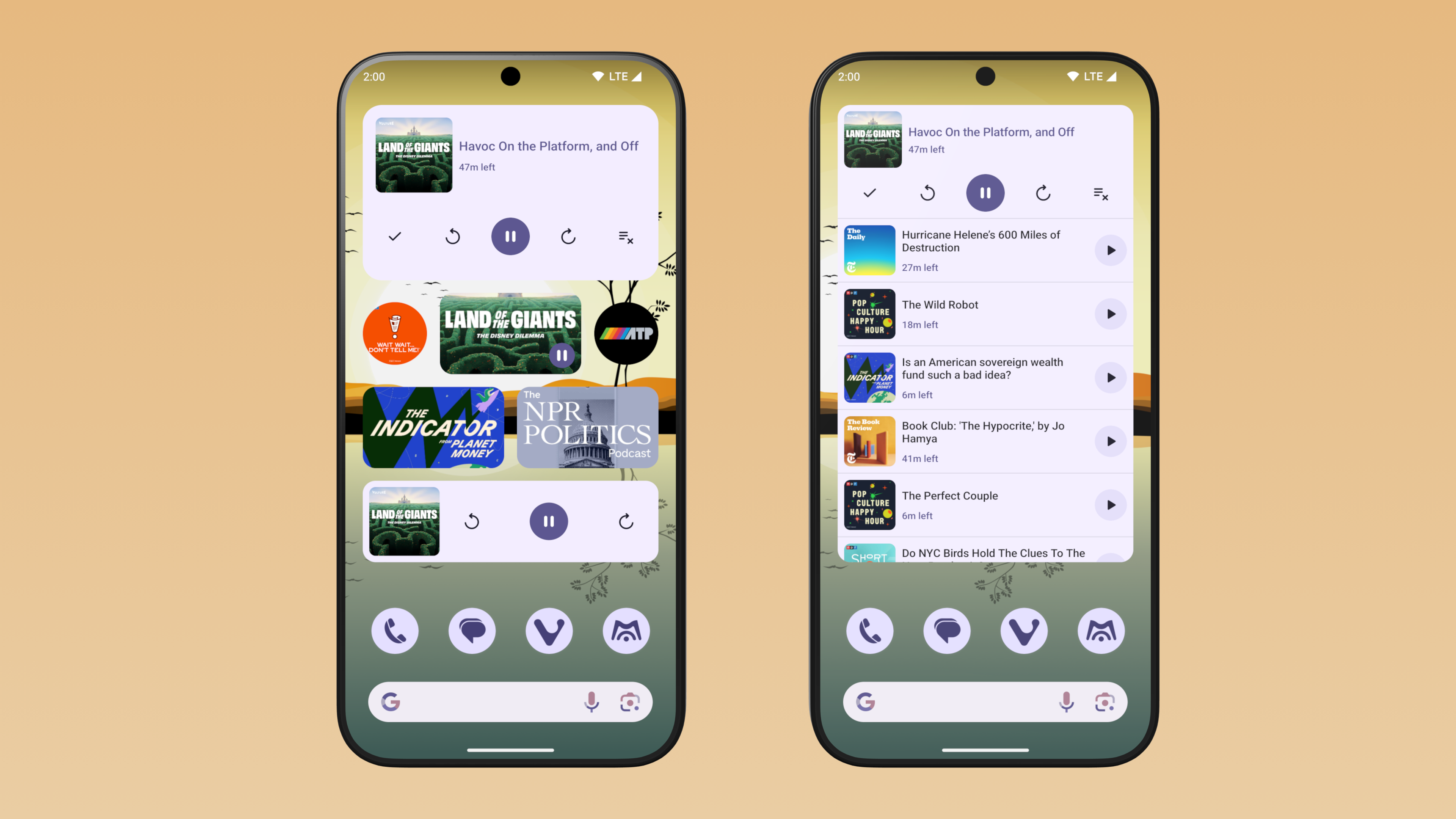
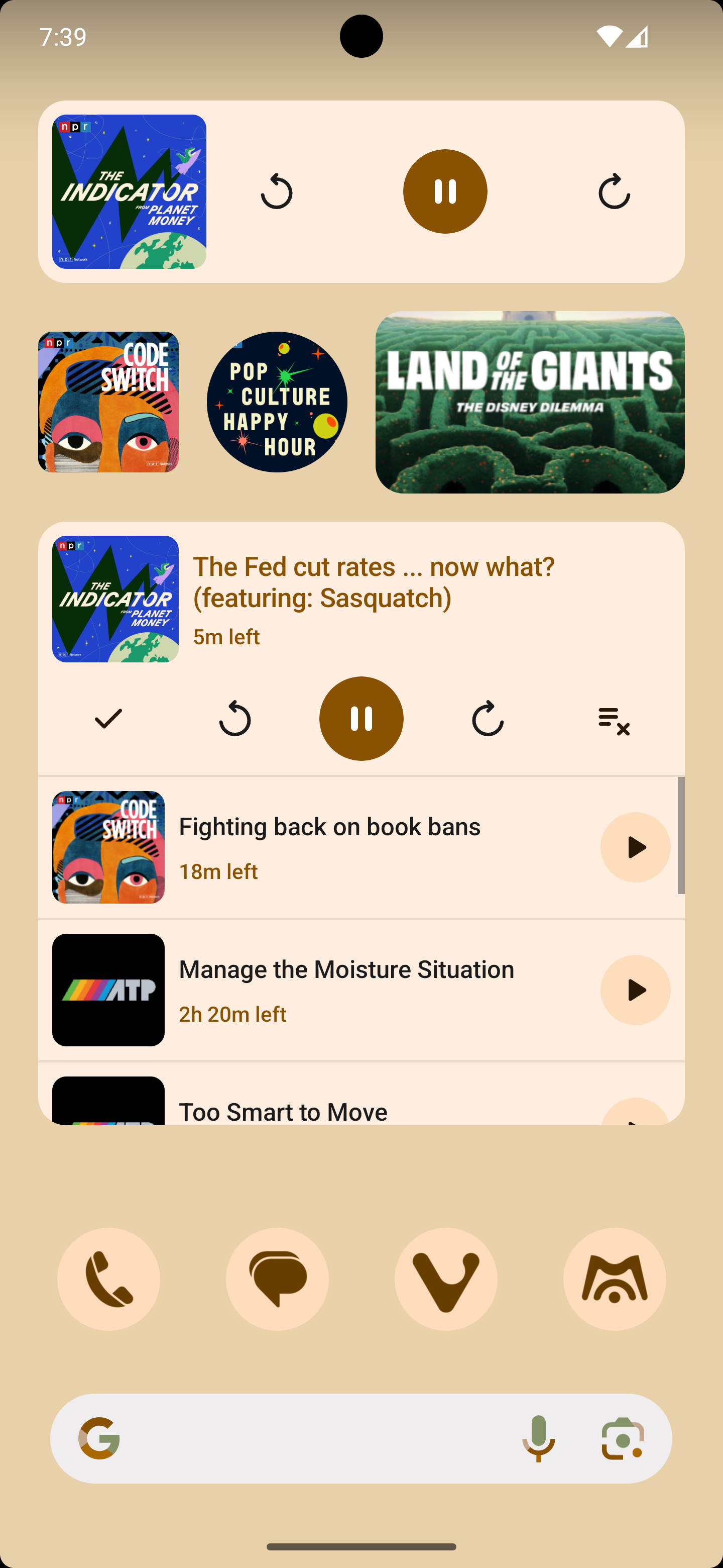
As part of this release I want to build 3 types of widgets:
- a short cut widget that when clicked will open the details screen about a particular podcast
- a player widget that allows user to perform play/pause, seek forward/backward actions
- a queue widget that also display the 10 episodes in the up next queue, along with the playback controls offered by player widget
Rounded Corners
miaocast uses mertial3 design system so there are a lot of rounded corners in the app. To be consistent and achieve a more modern look, I want the widgets to also have rounded corners. On Android S and above, there is GlanceModifier.cornerRadius modifier that works like Modifier.clip but I need to figure out a way to get rounded corners on lower version of Android.
After looking through the official documentation which briefly covers this, I got this working with the following Composable function:
@Composable
private fun RoundedCornerBox(
  modifier: GlanceModifier = GlanceModifier,
  cornerRadius: Dp = 8.dp,
  backgroundColor: ColorProvider = GlanceTheme.colors.widgetBackground,
  content: @Composable () -> Unit
) {
  Box(
    modifier = modifier.cornerRadiusCompat(cornerRadius, backgroundColor),
    contentAlignment = Alignment.Center,
    content = content
  )
}

private fun GlanceModifier.cornerRadiusCompat(
    radius: Dp, backgroundColor: ColorProvider
) = if (Build.VERSION.SDK_INT >= Build.VERSION_CODES.S) {
    this.cornerRadius(radius).background(backgroundColor)
  } else {
    val backgroundDrawable = when (radius) {
      4.dp -> R.drawable.widget_shape_small
      8.dp -> R.drawable.widget_shape_medium
      16.dp -> R.drawable.widget_shape_large
      else -> throw IllegalArgumentException("Unsupported radius $radius")
    }
    this.background(
      imageProvider = ImageProvider(resId = backgroundDrawable),
      colorFilter = ColorFilter.tint(backgroundColor)
    )
  }
On older version of Android, rounded corners are faked by having a rounded corner shaped background. The drawables used are just simple shapes with rounded corners:
<?xml version="1.0" encoding="utf-8"?>
<shape xmlns:android="http://schemas.android.com/apk/res/android">
    <corners android:radius="8dp" />
</shape>
Since this is not really clipping the container, there are a few drawbacks:
- This only works if you do not have any child views that has its own background color, otherwise those will stick out of the corners
- Does not work if you want rounded corners on other views like an image
I can live with the first downside as the widget does not have any subviews that set their own background that overlaps with the corners.
For second issue, I use the image transformation feature from coil to clip the image drawables itself before passing it on to be rendered in the RemoteView:
ImageRequest.Builder(context)
    .data(src)
    .apply {
        if (cornerRadius > 0.dp && Build.VERSION.SDK_INT < Build.VERSION_CODES.S) {
            val radius = with(Density(context)) { cornerRadius.toPx() }
            transformations(
                RoundedCornersTransformation(radius)
            )
        }
    }
    .build()
Previews
Android Studio Koala finally added support for previewing Glance AppWidget and this has been really useful in developing the widget. See the documentation on how to set up the necessary dependencies.
Since the widgets I’m developing supports multiple sizes, I wrote a simple preview composable to preview a particular widget in multiple sizes:
@Composable
fun GlancePreview(sizes: List<Pair<Int, Int>>, content: @Composable () -> Unit) {
    GlanceTheme {
        CompositionLocalProvider(
            LocalInspectionMode provides true
        ) {
            Column {
                sizes.forEach { (cellWidth, cellHeight) ->
                    GlancePreviewWithSize(
                        cellWidth = cellWidth,
                        cellHeight = cellHeight,
                        content = content
                    )
                }
            }
        }
    }
}

@Composable
private fun GlancePreviewWithSize(
    cellWidth: Int,
    cellHeight: Int,
    content: @Composable () -> Unit
) {
    Column(
        modifier = GlanceModifier.padding(vertical = 8.dp, horizontal = 16.dp),
        horizontalAlignment = Alignment.CenterHorizontally
    ) {
        Text(
            text = "$cellWidth x $cellHeight",
            style = TextStyle(
                color = GlanceTheme.colors.onSurface,
                fontSize = 16.sp,
                fontWeight = FontWeight.Bold
            ),
            modifier = GlanceModifier.padding(bottom = 16.dp)
        )

        val size = DpSize(
            width = cellWidth.dp * 73 - 16.dp,
            height = cellHeight.dp * 118 - 16.dp
        )
        Box(modifier = GlanceModifier.size(size.width, size.height)) {
            CompositionLocalProvider(LocalSize provides size) {
                content()
            }
        }
    }
}
The size of the widget is caluclated base on the formula: (73n - 16) x (118m - 16). See App widget sizing documentation for more details.
The preview function takes a list of sizes and renders all the sizes in a single preview:
@OptIn(ExperimentalGlancePreviewApi::class)
@Preview
@Composable
private fun NowPlayingWidgetPreview() {
    GlancePreview(sizes = listOf(4 to 1, 5 to 1)) {
        NowPlayingWidgetUi()
    }
}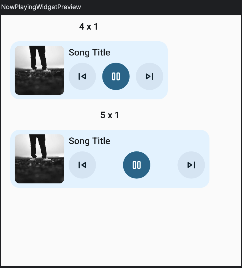
Note that you may need to break out the sizes into groups if the combined sizes exceeds the maximum size supported by Android Studio (2000dp I believe), otherwise they will get clipped.
Loading Image
To display the podcast image in the widget, I use coil to load the image with a custom composable that handles the rounded corner as mentioned above.
@Composable
fun GlanceImage(
    src: String,
    modifier: GlanceModifier = GlanceModifier,
    cornerRadius: Dp = 0.dp,
    contentDescription: String? = null
) {
    val context = LocalContext.current
    val isPreview = LocalInspectionMode.current
    var image by remember(src) {
        val placeholder = if (isPreview) {
            ResourcesCompat.getDrawable(
                context.resources,
                R.drawable.image_placeholder,
                null
            )?.toBitmapOrNull()
        } else {
            null
        }
        mutableStateOf(placeholder)
    }

    // Skip loading the image if we're in a preview, otherwise the
    // preview rendering will block forever waiting for the image to be loaded.
    if (!isPreview) {
        LaunchedEffect(src, cornerRadius) {
            val request = ImageRequest.Builder(context)
                .data(src)
                .apply {
                    val roundedCorner =
                        cornerRadius > 0.dp &&
                            Build.VERSION.SDK_INT < Build.VERSION_CODES.S
                    if (roundedCorner) {
                        val radius = with(Density(context)) {
                            cornerRadius.toPx()
                        }
                        transformations(
                            RoundedCornersTransformation(radius = radius)
                        )
                    }
                }
                .build()
            when (val result = context.imageLoader.execute(request)) {
                is SuccessResult -> {
                    image = result.drawable.toBitmapOrNull()
                }

                is ErrorResult -> {
                    Log.e(
                        "GlanceImage",
                        "Error loading image $src",
                        result.throwable
                    )
                }
            }
        }
    }

    RoundedCornerBox(modifier = modifier, cornerRadius = cornerRadius) {
        image?.let {
            Image(
                provider = ImageProvider(it),
                contentDescription = contentDescription
            )
        }
    }
}
Note that we need to avoid loading the image in preview mode, otherwise it breaks preview rendering
in Android Studio. Unlike regular Compose @Preview, which set the LocalInspectionMode to true
for us, we need to set this ourself if we want to check if we are in preview mode or not:
@Composable
fun GlancePreview(content: @Composable () -> Unit) {
    GlanceTheme {
        CompositionLocalProvider(
            LocalInspectionMode provides true
        ) {
            content()
        }
    }
}
Manage Widget State
App widgets are RemoteViews hosted by another application and each time you want to update the
widget you need to generate a new RemoteViews and send it to the host application such as the
launcher. The widget are also peoridically updated base on the updatePeriodMillis specified in the widget provider info. Like regular compose, you can think of this as turning your app or widget state into UIs that get rendered on the screen.
In Glance, widget state can be defined by providing a GlanceStateDefinition when implementing GlanceAppWidget. By default, the widget will use PreferencesGlanceStateDefinition, which stores the widget’s state in Preferences backed by a preferences file that is uniquedly tied to a particular instance of a widget. You can override this by providing a custom state definition.
In miaocast, I implemented a custom GlanceStateDefinition that stores the widget’s state as a
serialized json object:
class JsonStateDefinition<T>(val initialValue: T, val serializer: KSerializer<T>) :
    GlanceStateDefinition<T> {

    @OptIn(ExperimentalSerializationApi::class)
    override suspend fun getDataStore(
        context: Context, fileKey: String
    ): DataStore<T> =
        DataStoreFactory.create(
            serializer = object : Serializer<T> {
                override val defaultValue: T = initialValue

                override suspend fun readFrom(input: InputStream): T {
                    val string = input.bufferedReader().use { it.readText() }
                    return Json.decodeFromString(
                        deserializer = serializer, string = string
                    )
                }

                override suspend fun writeTo(t: T, output: OutputStream) {
                    Json.encodeToStream(serializer, t, output)
                }
            },
            produceFile = {
                getLocation(context, fileKey)
            },
        )

    override fun getLocation(context: Context, fileKey: String): File =
        context.dataStoreFile(fileKey)
}
This can be used to override the state definition of a widget:
class NowPlayingWidget : GlanceAppWidget() {
    override var stateDefinition = JsonStateDefinition(
        initialValue = NowPlayingTrack(),
        serializer = NowPlayingTrack.serializer()
    )
}
With this, Glance will load the state from the store when an update to the widget is requested and
render the widget UI with this state object. You can access this state object with
the currentState function provided by Glance.
When the widget is first placed on the user’s home screen, there would be no state persisted in the
data store and the defaultValue passed to the JsonStateDefinition will be used to render the widget UI. In order to show useful information immediately upon widget being placed, we also need to initlaize the state in those cases:
class NowPlayingWidget: GlanceAppWidget() {
    override var stateDefinition = JsonStateDefinition(
        initialValue = NowPlayingTrack(),
        serializer = NowPlayingTrack.serializer()
    )

    override suspend fun provideGlance(context: Context, id: GlanceId) {
          val initialState = initializeState(context = context, id = id)
          provideContent {
              val state: NowPlayingTrack = currentState<NowPlayingTrack>().let {
                  if (it.info == null) initialState else it
              }
              NowPlayingWidget(state = state)
          }
      }

      private suspend fun initializeState(
          context: Context, id: GlanceId
      ): NowPlayingTrack {
          val state =
              getAppWidgetState(
                  context = context,
                  definition = stateDefinition,
                  glanceId = id
              )
          return if (state.info == null) {
              // Load the initial state and store it in the widget's data store,
              // here we just use some sample data. In a real application,
              // you might want to load data from the server or a local database.
              val track = Tracks.tracks.first()
              val newState = NowPlayingTrack(info = track, isPlaying = false)

              // Also persist the update to the widget's data store
              updateAppWidgetState(
                  context = context,
                  definition = stateDefinition,
                  glanceId = id
              ) {
                  newState
              }
              newState
          } else {
              state
          }
      }
}
In your application, whenever you need to change the information displayed by the widget, you will need to:
- update the state stored in the widget’s data store
- call one of the
update(updateAll,updateorupdateIf) functions on the widget class to update the UI of the widget
val manager = GlanceAppWidgetManager(context)
val widget = NowPlayingWidget()
manager.getGlanceIds(NowPlayingWidget::class.java).forEach { glanceId ->
    updateAppWidgetState(
        context = context,
        definition = widget.stateDefinition,
        glanceId = glanceId
    ) {
       // ... update the stored state
    }
}
// We call updateAll here because all instances of NowPlayingWidget
// displays the same information.
widget.updateAll(context = context)
Handling User Interaction
There are a few common ways to handle user interaction:
- start a particular
Activity - start a service
- send a broadcast to a
BroadcastReceiver - run some code such as refresh the data from server
Those are usually attached to a composable in your widget’s UI using the clickable modifier. For
example, in miaocast, the podcast shortcut widget starts the MainActivity and navigate to the podcast detail screen with a deep link:
class OpenPodcastAction : ActionCallback {
    override suspend fun onAction(
        context: Context, glanceId: GlanceId, parameters: ActionParameters
    ) {
        val podcastId = parameters[PARAMETER_PODCAST_ID] ?: return
        val deepLink = PodcastScreen.makeDeepLink(podcastId = podcastId).toUri()
        val intent = Intent(
            Intent.ACTION_VIEW,
            deepLink,
            context,
            MainActivity::class.java
        ).apply {
            flags = Intent.FLAG_ACTIVITY_NEW_TASK or Intent.FLAG_ACTIVITY_SINGLE_TOP
        }
        context.startActivity(intent)
    }

    companion object {
        val PARAMETER_PODCAST_ID = ActionParameters.Key<Long>("podcast_id")
    }
}Box(
modifier = GlanceModifier
.fillMaxSize()
.clickable(
action = actionRunCallback<OpenPodcastAction>(
parameters = actionParametersOf(
OpenPodcastAction.PARAMETER_PODCAST_ID to podcastId
)
)
)
) {
// ...
}For other types of supported actions, see the official documentation.
Summary
One annoyonce with app widget in general is that you need to create several files to set up a widget:
- an xml file to provide the information about the widget, such as sizing info, description etc
- two preview files per widget (or more if you want those to vary base on qualifiers) for previewing the widget in the launcher’s widget picker UI
- an rendered image of your widget (for older Android version below S)
- an xml layout file that duplicates your widget’s UI (for Android S+)
- set styles to support dyanmic colors in the preview layout so that the user’s wallpaper colors are used on Android S+ in the widget picker UI
Overall it was pretty easy to create widget using Glance once you understand how widget states are fetched, updated and how the state is used to render the UI. Making sure that your widget UI and the preview stay in sync is a hassle and my hope is that I’ll not be updating those frequently in the future.
You can find the example code used in this post in the github repo.