 Xiaoming's Blog
Round and Round: Creating a Fun Custom Dial Control in Jetpack Compose
In this post, we will learn how to build a custom dial control component in
Jetpack Compose using Canvas, pointerInput and some math!
Background
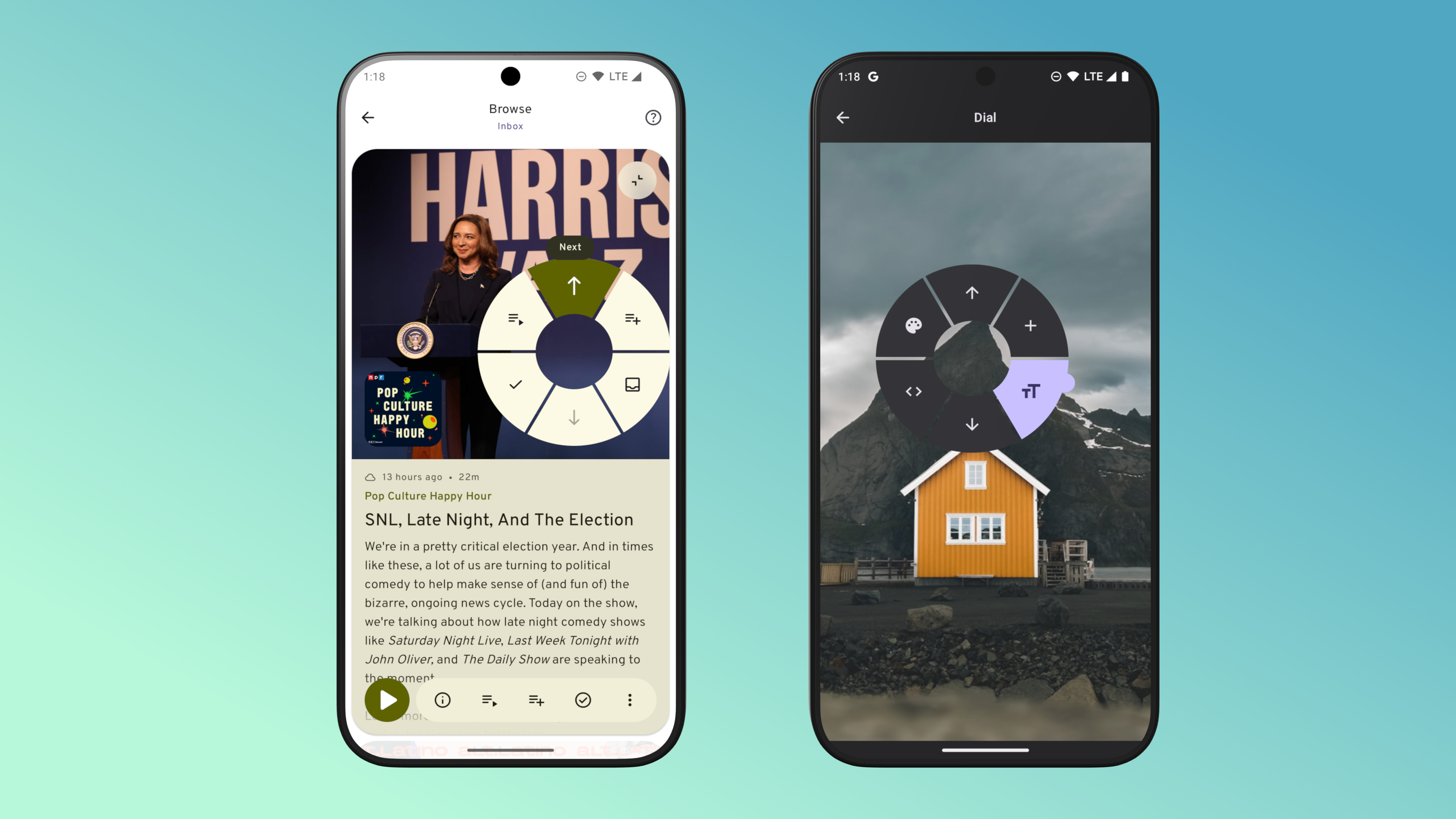
For miaocast’s v2024.5 release, I wanted to add a new way for users to quickly go through their podcast inbox or backlog to either add episodes to their queue or mark them as played. This interaction pattern is quite common nowdays such as in dating app where you can swipe left and right to perform a particular action, or in TikTok and other short form video apps where you can swipe up and down to browse the catalog.
The first option I explored was to use a VerticalPager combined with SwipeToDismissBox but
after playing with the prototype I realized that it will not work for my use case for a few reasons:
- The simply setup would only support two actions (besides the navigation action triggered by swipe up and down), one for swipe left and one for swipe right but I’d like to support at least 4 actions.
- It’s possible to add more actions to
SwipeToDimissBoxbut it would require users to carefully swipe and stop to select an option or require an extra click. - Lastly,
SwipeToDismissBoxis far too sensitive to swipes and can easily trigger on accident, especially when combined with the vertical swipe to go forward and back between episodes.
After experimenting with a few other options I settled on creating a custom dial control that works similar to the classic iPod click wheel:
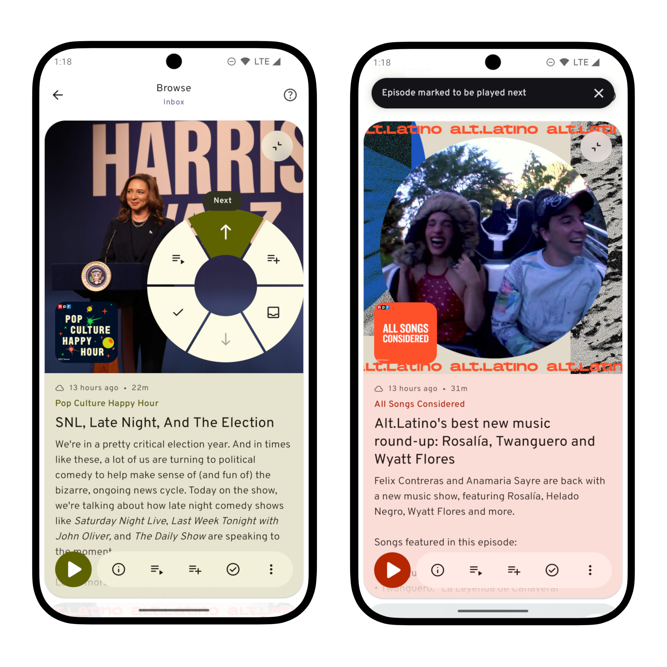
On the browse screen, user can bring up the quick action dial by tap anywhere on the screen and then continue to swipe in different directions to select an action to trigger. For the browse inbox screen, the dial has six actions:
- Swipe up and down to go to next / previous episode
- Swipe upper left or upper right will add episode to top or bottom of the queue
- Swipe lower left or lower right will mark the episode as played or remove it from inbox
You can see a short demo of the gesture in this video (Youtube).
Implementation
In this blog post, I will break down the implementation to 3 steps:
- Drawing the dial graphics
- Adding gestures
- Generalize the control and make it reusable
Drawing the dial control
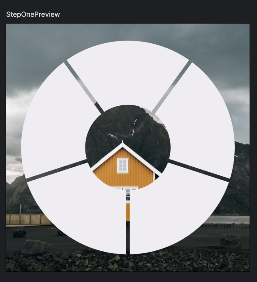
The dial background is a circle that has the center cutoff along with some lines between each
section. This can be achieved using a Canvas in compose:
@Composable
fun <T> DialControl(options: List<T>, modifier: Modifier = Modifier) {
    val dialColor = Color.Yellow
    val backgroundColor = Color.Gray
    val dialCount = options.size
    Canvas(modifier = modifier.background(color = backgroundColor)) {
        drawCircle(color = dialColor)
        scale(0.4f) {
            drawCircle(color = backgroundColor)
        }
        val sweep = 360f / dialCount
        var i = 0
        // We want the first option's middle point to line up at -90degrees.
        val startDegree = -90f - sweep / 2
        while (i < dialCount) {
            rotate(startDegree + sweep * i) {
                drawLine(
                    color = backgroundColor,
                    start = center,
                    end = Offset(x = size.width, y = size.height / 2),
                    strokeWidth = 6.dp.toPx()
                )
            }
            i++
        }
    }
}
With this, we get something like:
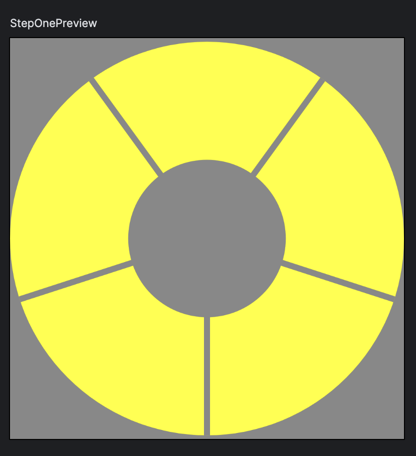
Canvas and Modifiers like Modifier.drawBehind, Modifier.drawWithCache provide us with a
DrawScope, which supports transformations functions such as scale, rotate, inset etc. In
this example, we use scale to draw a smaller circle and use rotate to repeatly draw a line
from the center of the canvas to the CenterEnd point of the canvas to create the background of the
dial component.
One issue with the above code is that we’ve hard coded the colors used, and we can fix that by pdating the API to take colors as parameters such as:
@Composable
fun DialControl(
    modifier: Modifier = Modifier,
    dialColor: Color = MaterialTheme.colors.surfaceContainer,
    backgroundColor: Color = MaterialTheme.colors.primaryContainer
) {
    // ...
}
However, this approach means that the dial will always have a solid background, which may not work in some cases where we need to place the control on top of a non solid background such as an image:
To fix this and make the component more flexible, we’d like to have a transparent background. We
can achieve this by creating a custom shape that draws precisely where the sections are and nothing
else but that’s very complicated. Luckily, we can make a few tweaks to the above code to achieve
this by leveraging BlendMode when drawing the shapes:
@Composable
fun <T> DialControl(
    options: List<T>,
    modifier: Modifier = Modifier,
    dialColor: Color = MaterialTheme.colorScheme.surfaceContainer,
) {
    val dialCount = options.size
    Canvas(
        modifier = modifier.graphicsLayer {
            compositingStrategy = CompositingStrategy.Offscreen
        }
    ) {
        drawCircle(color = dialColor)
        scale(0.4f) {
            // Use BlendMode.Clear to clear the inner section of the Canvas.
            drawCircle(color = Color.Black, blendMode = BlendMode.Clear)
        }
        val sweep = 360f / dialCount
        var i = 0
        // We want the first option's middle point to line up at -90degrees.
        val startDegree = -90f - sweep / 2
        while (i < dialCount) {
            rotate(startDegree + sweep * i) {
                // Use BlendMode.Clear to clear where the line was drawn
                drawLine(
                    color = Color.Black,
                    start = center,
                    end = Offset(x = size.width, y = size.height / 2),
                    strokeWidth = 6.dp.toPx(),
                    blendMode = BlendMode.Clear
                )
            }
            i++
        }
    }
}- Using
BlendMode.Clearwill clears the background where we draw the inner circle and the dividing lines - Setting the
Canvas’s graphics layer to useCompositionStrategy.OffScreenensures that the cleared area does not have anything beind it, otherwise it will show the window background which is black
With these two small changes, we get the desired behavior:
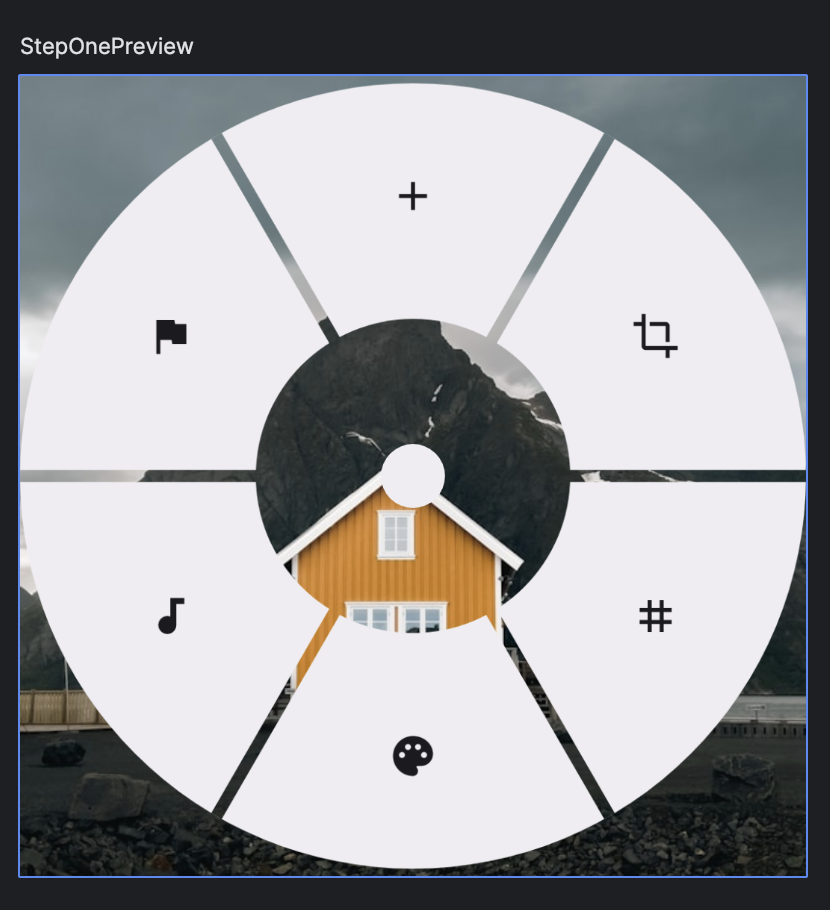
Next thing we need to draw is the content that will be rendered in each wheel section. To make the component more reusable, we will add a parameter to the composable function that let the caller define how to render each section and the dial control will take care of positioning those controls.
@Composable
fun <T> DialControl(
    options: List<T>,
    optionContent: @Composable (T) -> Unit,
    modifier: Modifier = Modifier,
    dialSize: Dp = 240.dp,
    dialColor: Color = MaterialTheme.colorScheme.surfaceContainer,
) {
    val cutOffFraction = 0.4f
    val dialCount = options.size
    val sweep = 360f / dialCount
    // We want the first option's middle point to line up at -90degrees.
    val startDegree = -90f - sweep / 2
    Box(modifier = modifier.size(dialSize), contentAlignment = Alignment.Center) {
        // Draw the background using canvas
        // ...

        options.forEachIndexed { index, option ->
            Box(
                modifier = Modifier.graphicsLayer {
                    val angle = startDegree + sweep * index
                    val radians = (angle + sweep / 2) * Math.PI / 180
                    val radius =
                        (dialSize.toPx() / 2) * (cutOffFraction + (1f - cutOffFraction) / 2)
                    translationX = (radius * cos(radians)).toFloat()
                    translationY = (radius * sin(radians)).toFloat()
                }
            ) {
                optionContent(option)
            }
        }
    }
}
The position of each option is cacluated based on its rotation and overall radius of the dial:
val angle = startDegree + sweep * indexandval radians = (angle + sweep / 2) * Math.PI / 180converts the rotation from degrees to radiansval radius = (dialSize.toPx() / 2) * (cutOffFraction + (1f - cutOffFraction) / 2)caculate the horizontal offset that should be applied to the option so that it is placed in the center of the dial section- Once we have the radius and the radian, we can get the offset
xandyand apply those offset usingtranslationXandtranslationYconfiguration on the graphics layer
To support this, we’ve also added a parameter to define the size of the dial.
One last thing before we finish this step is to draw an indicator that will move around when we swipe on the control to select an option. This can be a simple dot that rest at the center of the dial:
// Draw the Dial background using Canvas
// ...
// Draw the options for each section
// ...
// Draw an indicator at the center
Box(
  modifier = Modifier
    .size(32.dp)
    .background(color = dialColor, shape = CircleShape)
)
With this setup, we can render a dial with some icons like:
val icons = listOf(
    Icons.Filled.Add,
    Icons.Filled.Crop,
    Icons.Filled.Tag,
    Icons.Filled.Palette,
    Icons.Filled.Audiotrack,
    Icons.Filled.Flag
)
DialControl(
    options = icons,
    optionContent = {
        IconButton(onClick = {}) {
            Icon(imageVector = it, contentDescription = null)
        }
    },
    dialSize = 400.dp,
    modifier = Modifier
)
Add Gestures Support
Before we add gestures support, let’s tidy up the code a bit to make the further changes easier.
Specifically:
- Extract the configuration of the control into a data class
DialConfig - Split out the background, content and indicator of the dial into separate composable functions
You can find the complete code here: https://gist.github.com/emeowj/456d5e01d401e807dcbcaa713b6136c8
Show and hide the control
The dial control will initially be hidden and only show when the user touches somewhere on the
screen. To toggle the visibility of the dial, we can use AnimatedVisibility:
var visible by remember { mutableStateOf(false) }
Box(modifier = modifier) {
    AnimatedVisibility(
        visible = visible,
        enter = scaleIn() + fadeIn(),
        exit = scaleOut() + fadeOut(),
    ) {
        // ...
    }
}
Now we just need to toggle the visible flag on and off by attaching a gesture handler to the
container box:
Box(
    modifier = modifier.pointerInput(Unit) {
        awaitEachGesture {
            val down = awaitFirstDown()
            visible = true
            var change = awaitDragOrCancellation(pointerId = down.id)
            while (change != null && change.pressed) {
                change = awaitDragOrCancellation(pointerId = change.id)
            }
            visible = false
        }
    }
) {
    // ...
}
This works but the control will always be positioned at the top start of the containing Box, which
is not what we want. We’d like the control to be centered whereever the touch was and for that we
need another state to keep track of the offset:
var visible by remember { mutableStateOf(false) }
var offset by remember { mutableStateOf(Offset.Zero) }
Box(
    modifier = modifier.pointerInput(Unit) {
        awaitEachGesture {
            val down = awaitFirstDown()
            visible = true
            offset = down.position
            var change = awaitDragOrCancellation(pointerId = down.id)
            while (change != null && change.pressed) {
                change = awaitDragOrCancellation(pointerId = change.id)
            }
            visible = false
        }
    }
) {
    AnimatedVisibility(
        visible = visible,
        enter = scaleIn() + fadeIn(),
        exit = scaleOut() + fadeOut(),
        modifier = Modifier.graphicsLayer {
            (offset - size.center).let {
                translationX = it.x
                translationY = it.y
            }
        }
    ) {
        // ...
    }
}
We are using graphicsLayer instead of just Modifier.offset because we need to know the size of
the dial control to apply additional offset to move the center of the control to the (x, y) coordinates
of offset.
Position the indicator
We’d also like the indicator to follow the touch so that it moves to whereever the touch point is. To do this, we need another state:
var indicatorOffset by remember { mutableStateOf(Offset.Zero) }var change = awaitDragOrCancellation(pointerId = down.id)
while (change != null && change.pressed) {
// Update the indicator position base on the drag gesture
indicatorOffset += change.positionChange()
change = awaitDragOrCancellation(pointerId = change.id)
}
visible = false
// Reset the indicator position when the drag is cancelled
indicatorOffset = Offset.Zero// Apply the offset to the indicator using offset
Box(modifier = Modifier.offset { indicatorOffset.round() }) {
indicator()
}We can use offset for the indicator because it is already centered in the dial control and the
indicatorOffset is relative to it’s parent (DialControl in this case), so it does not need to
be concerned about the offset of the DialControl itself.
Animating the indicator
If you run the code now you’ll notice that when we lift the finger and cancel the drag, the indicator immediatly jumps to the center of the control. To make this transition smoother, we should animate the indicator position change when the touch is lifted:
val indicatorOffset = remember {
    Animatable(
        initialValue = Offset.Zero,
        typeConverter = Offset.VectorConverter
    )
}
To do this, we first update the code to use a Animatable to store the offset.
According to the documentation:
Animatableis a value holder that automatically animates its value when the value is changed viaanimateTo.
So we can call animateTo(Offset.Zero) when the gesture ends to animate the
indicator back to its resting position. During dragging, we want to update the
position without animation and for that we can use snapTo method on the Animatable:
while (change != null && change.pressed) {
    val delta = change.positionChange()
    coroutineScope.launch {
        // Snap to the value while dragging so the indicator
        // follows the finger.
        indicatorOffset.snapTo(indicatorOffset.value + delta)
    }
    change = awaitDragOrCancellation(pointerId = change.id)
}
visible = false
coroutineScope.launch {
    // Animate the indicator back to the center when lifted.
    indicatorOffset.animateTo(Offset.Zero)
}
Note that both animateTo and snapTo are suspend functions, so we also
need to create a CoroutineScope using rememberCoroutineScope to call those method
To read the up to date value of indicatorOffset, we use the value property:
Box(
    modifier = Modifier
        .offset {
            // Access the current offset value using
            // Animatable.value property
            indicatorOffset.value.round()
        }
        .size(config.indicatorSize)
        .background(color = dialColor, shape = CircleShape)
)
It’s important that we access the value property only during layout phase
and not composition phase by using the version of Modifier.offset that takes
a lamada, otherwise we’d introduce lots of recomposition when the value animates.
See this documentation to learn more.
Calculate the selected option
Now that we have the coordinates / offset of the indicator, we can calculate the selected option when user moves the indicator around. The requirement:
- When the indicator is inside the cutoff circel, no selection is made
- When the indicator overlaps a section of the dial, the overlapped section is selected
The calculation involves a bit of math:
val density = LocalDensity.current
val selectedOption: T? by remember {
    derivedStateOf {
        val sizePx = with(density) { config.dialSize.toPx() }
        val radius = sizePx / 2
        val currentOffset = indicatorOffset.value
        val distance = currentOffset.getDistance()
        if (distance < radius * config.cutOffFraction) {
            // No selection is made if the indicator is
            // within the cutoff region
            null
        } else {
            // Calculate the rotation degree of the offset
            // at (x, y) and compare it to the dial sections
            // to find the selection
            val radians = atan2(y = currentOffset.y, x = currentOffset.x)
            val degree = (180f / Math.PI) * radians
            val sweep = 360f / options.size
            val startAngle = calculateStartAngle(options.size)
            val index = options.indices.firstOrNull { index ->
                val start = startAngle + sweep * index
                val end = start + sweep
                degree >= start && degree < end
            } ?: options.lastIndex
            options[index]
        }
    }
}
Here we use derivedStateOf to calculate the selection whenever indicatorOffset changes and
only recompose when the resulting selectedOption changes and not everytime indicatorOffset changes.
Draw the selection
Now that we have the selected option, we need to update the UI to reflect when selection changes. There are many ways to do this but in this example, we will just change the background of the selected dial section:
Canvas(
    modifier = modifier
        .fillMaxSize()
        .graphicsLayer {
            compositingStrategy = CompositingStrategy.Offscreen
        }
) {
    val startDegree = calculateStartAngle(sectionCount)
    val sweep = 360f / sectionCount
    var i = 0
    while (i < sectionCount) {
        rotate(startDegree + sweep * i) {
            // Instead of drawing a whole circle, we now draw each
            // dial section separately so that we can use different
            // color for the selected vs unselected sections.
            drawArc(
                color = if (i == selectedIndex) selectedColor else color,
                startAngle = 0f,
                sweepAngle = sweep,
                useCenter = true
            )
            drawLine(
                color = Color.Black,
                start = center,
                end = Offset(x = size.width, y = size.height / 2),
                strokeWidth = 6.dp.toPx(),
                blendMode = BlendMode.Clear
            )
        }
        i++
    }

    scale(cutOffFraction) {
        drawCircle(color = Color.Black, blendMode = BlendMode.Clear)
    }
}
We can also pass the selection to the caller when rendering the dial section content so the content can vary depending on if the section is selected or not:
@Composable
fun <T> DialControlBox(
    options: List<T>,
    optionContent: @Composable (T, Boolean) -> Unit,
    ...
)

// At the callsite:
DialControlBox(
    options = icons,
    optionContent = { icon, selected ->
        IconButton(onClick = {}) {
            Icon(
                imageVector = icon,
                contentDescription = null,
                // Use different tint for the icon if selected
                tint = if (selected) {
                    MaterialTheme.colorScheme.onPrimary
                } else {
                    LocalContentColor.current
                }
            )
        }
    },
    modifier = Modifier.fillMaxSize()
)
Animate the selection
We can improve this interaction by adding some animation when the selection
changes so that the transition is smoother. In this example, I’d like the
selected section to animate and scale out from the center of the dial.
Here is where Animatable once again comes handy:
val sectionScales = remember(options) {
    // For each section, an Animatable is used to store it's scale
    options.associateWith {
        Animatable(
            initialValue = 0f,
            typeConverter = Float.VectorConverter
        )
    }
}
For each option, we create an instance of Animatable that contains a float
for the scale of the section for that option. Then when the selection changes,
we animate the selected section’s scale up to 1f and all other sections down
to 0f:
LaunchedEffect(options, selectedOption) {
    // Update each section's scale base on the current selection
    sectionScales.forEach { (option, scale) ->
        launch {
            scale.animateTo(
                targetValue =
                    if (option == selectedOption) 1f else 0f,
                animationSpec =
                    spring(dampingRatio = Spring.DampingRatioLowBouncy)
            )
        }
    }
}
Once we have the scales, we can update the dial drawing to draw a scaled section that will reflect the section:
// We can go back to drawing a circle for the background.
drawCircle(color = color)
val startDegree = calculateStartAngle(sectionCount)
val sweep = 360f / sectionCount
var i = 0
while (i < sectionCount) {
    rotate(startDegree + sweep * i) {
        // We scale the section base on the selection state
        scale(sectionScale(i)) {
            drawArc(
                color = selectedColor,
                startAngle = 0f,
                sweepAngle = sweep,
                useCenter = true
            )
        }

        drawLine(
            color = Color.Black,
            start = center,
            end = Offset(x = size.width, y = size.height / 2),
            strokeWidth = 6.dp.toPx(),
            blendMode = BlendMode.Clear
        )
    }
    i++
}
sectionScale(i) is a function that takes the index of the section and
returns the current scale value for that section.
With this, we get a bouncy animation when we move around in the dial:
Trigger Selected Action
Now that we have selected option, we can trigger some action when the touch is released while the selection is active. If the user drag the indicator back to the cutoff region, then no action should be triggered. Also note that we don’t want trigger the action each time when the selection made, only when the touch is released.
To achieve this, we first need to update the API to allow caller to provide a callback for the action and then we can call the provided callback on gesture end if the selection is active:
@Composable
fun <T> DialControlBox(
    options: List<T>,
    optionContent: @Composable (T, Boolean) -> Unit,
    onSelected: (T) -> Unit,
    modifier: Modifier = Modifier, config: DialConfig = DialConfig()
) {
    // ..
}
awaitEachGesture {
// ...
visible = false
// Triger the action before animating the indicatorOffset back to zero
selectedOption?.let(onSelected)
coroutineScope.launch {
indicatorOffset.animateTo(Offset.Zero)
}
}You can find the complete code until now in this gist: https://gist.github.com/emeowj/7474ab49a0a77a9493a542eabb67812d
Generalize & Polish
A Little Refactoring
Right now DialControl has quite a few states that it needs to keep track of and the code is a bit
messy. We can extract and encapsulate the state of the dial control into a standalone class:
@Stable
class DialControlState<T>(
    val options: List<T>,
    val onOptionSelected: (T) -> Unit,
    val config: DialConfig,
    private val density: Density,
    private val coroutineScope: CoroutineScope,
) {

    var visible by mutableStateOf(false)
        private set
    var offset by mutableStateOf(Offset.Zero)
        private set

    val indicatorOffset = Animatable(
        initialValue = Offset.Zero,
        typeConverter = Offset.VectorConverter
    )

    val selectedOption: T? by derivedStateOf {
        val sizePx = with(density) { config.dialSize.toPx() }
        val radius = sizePx / 2
        val currentOffset = indicatorOffset.value
        val distance = currentOffset.getDistance()
        if (distance < radius * config.cutOffFraction) {
            null
        } else {
            val radians = atan2(y = currentOffset.y, x = currentOffset.x)
            val degree = (180f / Math.PI) * radians
            val startAngle = calculateStartAngle(options.size)
            val sweep = 360f / options.size
            val index = options.indices.firstOrNull { index ->
                val start = startAngle + sweep * index
                val endAngle = start + sweep
                degree >= startAngle && degree < endAngle
            } ?: options.lastIndex
            options[index]
        }
    }

    val sectionScales = options.associateWith {
        Animatable(
            initialValue = 0f,
            typeConverter = Float.VectorConverter
        )
    }

    init {
        coroutineScope.launch {
            snapshotFlow { selectedOption }
                .collect { selected ->
                    val animationSpec =
                        spring(dampingRatio = Spring.DampingRatioLowBouncy)
                    sectionScales.forEach { (option, scale) ->
                        launch {
                            scale.animateTo(
                                targetValue = if (option == selected) 1f else 0f,
                                animationSpec = animationSpec
                            )
                        }
                    }
                }
        }
    }

    fun onDown(position: Offset) {
        visible = true
        offset = position
    }

    fun onDrag(dragAmount: Offset) {
        coroutineScope.launch {
            indicatorOffset.snapTo(indicatorOffset.value + dragAmount)
        }
    }

    fun onRelease() {
        visible = false
        selectedOption?.let(onOptionSelected)
        coroutineScope.launch {
            indicatorOffset.animateTo(Offset.Zero)
        }
    }
}

private fun Modifier.dialControlBox(state: DialControlState<*>) =
    pointerInput(state) {
        awaitEachGesture {
            val down = awaitFirstDown()
            state.onDown(position = down.position)
            var change = awaitDragOrCancellation(pointerId = down.id)
            while (change != null && change.pressed) {
                state.onDrag(dragAmount = change.positionChange())
                change = awaitDragOrCancellation(pointerId = change.id)
            }
            state.onRelease()
        }
    }
We can also add a helper function to help create instance of DialControlState:
@Composable
fun <T> rememberDialState(
    options: List<T>,
    onSelected: (T) -> Unit,
    config: DialConfig = DialConfig()
): DialControlState<T> {
    val density = LocalDensity.current
    val coroutineScope = rememberCoroutineScope()
    return remember(options, onSelected, config, density) {
        DialControlState(
            options = options,
            onOptionSelected = onSelected,
            config = config,
            density = density,
            coroutineScope = coroutineScope
        )
    }
}
With this, the DialControlBox will only be responsible for composing the control and all state
management is moved ot DialControlState class:
@Composable
fun <T> DialControlBox(
    options: List<T>,
    optionContent: @Composable (T, Boolean) -> Unit,
    onSelected: (T) -> Unit,
    config: DialConfig = DialConfig(),
    state: DialControlState<T> = rememberDialState(
        options = options,
        onSelected = onSelected,
        config = config
    ),
    modifier: Modifier = Modifier,
    content: @Composable BoxScope.() -> Unit,
) {
    Box(modifier = modifier.dialControlBox(state)) {
        // Draw the content first
        content()

        // Then draw the dial control on top of the content
        // ...
    }
}
Final Touches
The animation selection is nice but at the moment the interaction with the dial feel like it is lacking something. We can enhance this by firing off some haptic feedback when user makes a selection.
We can fire off a haptic every time the selectedOption changes, but after playing with it in the
miaocast app I find that is a bit too much as every action will fire at least two haptics:
- when selection changed from
nullto non-nullvalue - again when the action is triggered and the selection is reset back to
null
Ideally, we’d like to skip the haptics when the action is fired and the selection is reset to null.
We can do this with the zip operation on the selection flow:
val hapticFeedback = LocalHapticFeedback.current
LaunchedEffect(state) {
    val selection = snapshotFlow { state.selectedOption }
    // Using zip, we can get a flow of both the previous and
    // current value of selectedOption
    selection
        .zip(selection.drop(1)) { previous, current ->
            if (previous != current && current != null) {
                HapticFeedbackType.LongPress
            } else {
                null
            }
        }
        .filterNotNull()
        .collect {
            hapticFeedback.performHapticFeedback(it)
        }
}
You can find the complete code in this gist: https://gist.github.com/emeowj/d3ef987aad0f891a83c1bdcbfd538018
Since this post is already really long, I skipped the part where we clamp the indicator’s offset so that it stays within the bounds of the dial cirle. You can find the complete implementation in this Github Repo.
Conclusion
It’s cool to have some unique control in your app but generally you should avoid creating custom controls since getting the accessibility right can be challenging. In the context of miaocast’s browse feature, I feel like it’s ok to do this since the dial acts like a complementary control and all the actions can still be performed using the persistent on screen bottom action bar.
If you’ve enjoyed this post and would like to try this out in a real app, please download miaocast today from Google Play and give it spin!
Photo used in the demo UI by Michael Baccin on Unsplash