 Xiaoming's Blog
Building Lynx: Day Three
Here is a summary of day three building Lynx, a new mastodon client. The main things I accomplished today are:
- enabled release build for the app
- added support for rendering status content as HTML
- added support for rendering preview card attached to an status
- added support for rendering image attachments
In this post, I will go over some of the interesting bits of buidling out the UI.
Enable Release Mode
Compose in debug mode is really slow so the first task of the day is to set up release build for the app so that I can run release build on my phone to test the app for real.
Signed and Shrinked
First, I need to set up signingConfig for debug and release build variants,
which involves creating a release signing key. This is pretty easy with Android
Studio following the guide.
Not sure how everyone else does it, but I’ve been just storing the keystore itself and the password for the keystore and the key in 1password but so far it has been working well for me.
Here is a bit of snippet to set up release signing in gradle:
val useReleaseKeyStore = rootProject.file("release/app-release.jks").exists()

signingConfigs {
    getByName("debug") {
        storeFile = rootProject.file("release/lynx-debug.jks")
        storePassword = "android"
        keyAlias = "debug"
        keyPassword = "android"
    }

    create("release") {
        storeFile = rootProject.file("release/lynx-release.jks")
        storePassword = properties["LYNX_RELEASE_KEYSTORE_PASSWORD"]?.toString() ?: ""
        keyAlias = "app-release"
        keyPassword = properties["LYNX_RELEASE_KEY_PASSWORD"]?.toString() ?: ""
    }
}

buildTypes {
    val signingConfigName = if (useReleaseKeyStore) "release"  else "debug"

    debug {
        signingConfig = signingConfigs.getByName(signingConfigName)
        versionNameSuffix = "-debug"
    }

    release {
        isMinifyEnabled = true
        isShrinkResources = true

        proguardFiles(
            getDefaultProguardFile("proguard-android-optimize.txt"),
            "proguard-rules.pro"
        )

        signingConfig = signingConfigs.getByName(signingConfigName)
    }
}
One tip I have is to use the same key for signing both debug and release build. This way, I can switch between debug and release build and not have to reinstall the app between the switch (otherwise the system complains about mismatched signatures). The debug signing key is still used when not building on my machine, where the release key won’t be available.
Enable R8
After sorting out the release key issue, the next step is to enable R8. My knowledge
of R8 is pretty limited. So far the only thing I had to pay attention to is
the proguard configuration.
The app uses Moshi for json parsing and Retrofit for network api calls. Without adding any proguard rules, I got an error in release mode:
java.lang.Class cannot be cast to java.lang.reflect.ParameterizedTypeAfter a bit of googling and trial and error, managed to fix this by a single line of proguard configuration:
-keep class studio.supermiao.lynx.mastodon.** { *; }Not sure if this is the correct thing to do, but just keeping the everything under the package where retrofit services are defined fixed the issue. Moving on.
Building Out the Timeline View
The rest of the day was spent on building out the home page’s timeline view.
HTML and emojis
I’ve already solved this part in my last attempt to build a mastodon client, so I was able to just copy and paste some old code to add support for rendering the status content as HTML and support mastodon’s custom emoji feature.
One thing worth noting is the lesser known feature of InlineTextContent api
in compose, which I used for rendering custom emojis that can appear
in a user’s display name (and the status content I believe).
For example, a user’s display name might be Foo Bar :robot: and need to be
rendered as Foo Bar 🤖. To implement this, I first have to find all the
placeholders in the text that are emojis and then build an AnnotatedString
that tags those emojis for replacement later:
private typealias EmojiContent = Map<String, Emoji>

private fun buildAnnotatedString(
    content: AnnotatedString,
    emojis: List<Emoji>
): Pair<AnnotatedString, EmojiContent> {
    return if (emojis.isEmpty()) {
        content to emptyMap()
    } else {
        val usedEmoji = mutableMapOf<String, Emoji>()
        val emojiMap = emojis.associateBy { ":${it.shortcode}:" }
        val builder = AnnotatedString.Builder(content)

        val matcher = EMOJI_PATTERN.matcher(content.text)
        while (matcher.find()) {
            val match = matcher.group()
            val emoji = emojiMap[match]
            if (emoji != null) {
                builder.addStringAnnotation(
                    tag = "androidx.compose.foundation.text.inlineContent",
                    annotation = match,
                    start = matcher.start(),
                    end = matcher.start() + match.length
                )
                usedEmoji[match] = emoji
            }
        }
        return builder.toAnnotatedString() to usedEmoji
    }
}

private val EMOJI_PATTERN = Pattern.compile(":\w+:")
I have to do a hacky thing here by using the magic constant
androidx.compose.foundation.text.inlineContent used by compose to tag inline
content for replacement. The official api only support
appending text and an opaque annotation to an AnnotatedString but here
we already have the text, we just need to add an annotation on the span. Luckily,
compose is unbundled so unless they change how inline content are tag in a future
release, this hack would continue to work.
There are still lots to be done to render the status, such as handling clicking hashtag, link to other status etc but now that HTML and emjois are supported. the app suddenly felt like a real thing now.
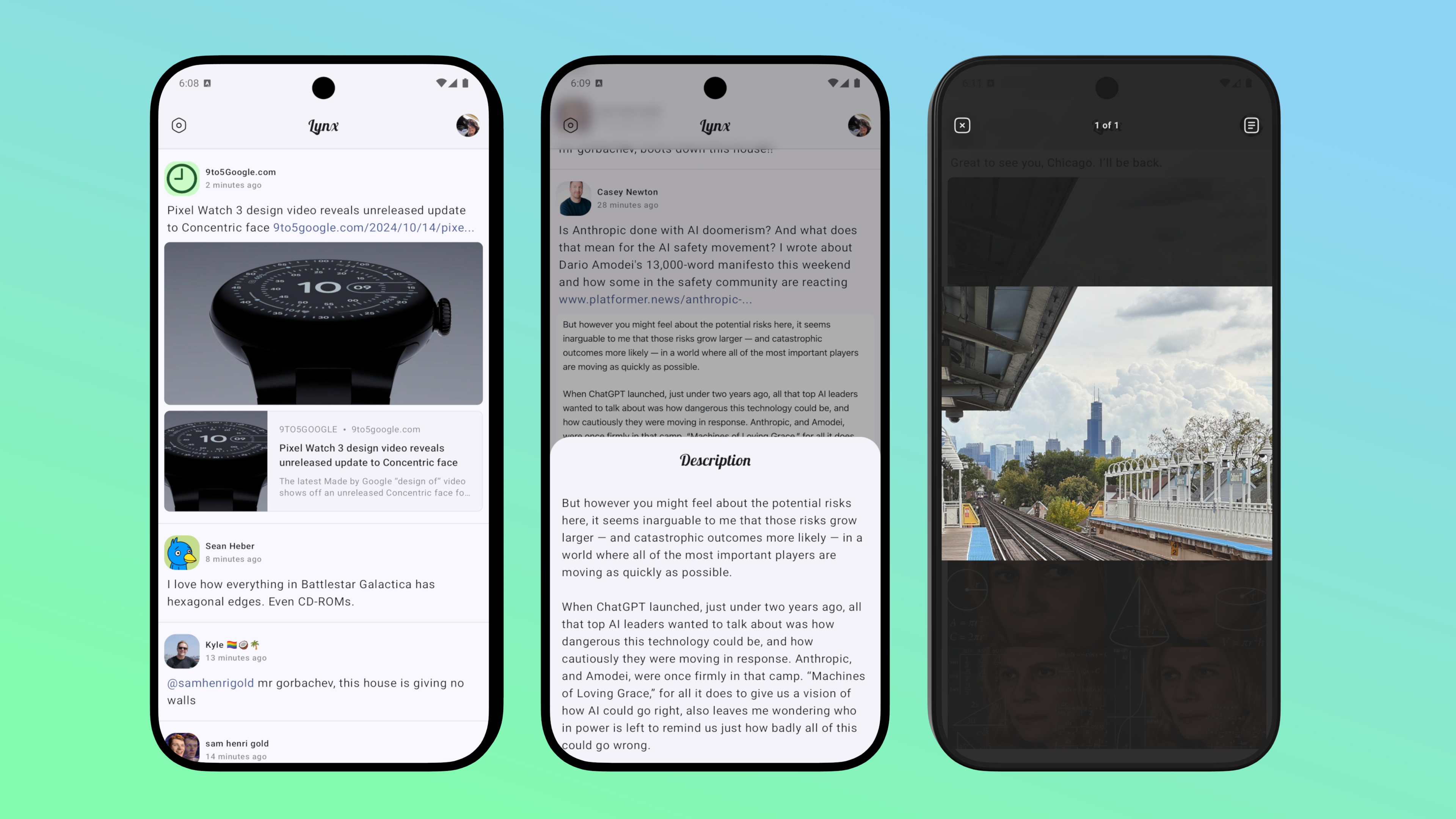
The Media Viewer
I’ve also started working on support for viewing media attachments. So far only images are supported and I plan to work on video and gifs (gifs are just silient videos in mastodon) tomorrow.
A Detour to UI Pattern
One feature of the media viewer is to support viewing alt text attached to an
media. For this, I used a simply utlities library called circuit-overlay, which
is part of the larger circuit framework. I’m not using circuit itself but
I do follow the basic pattern of the framework where each screen are rendered
using a UiModel that looks like:
@Immutable
class HomeScreenUiModel(
  val stateFlow: StateFlow<HomeScreenUiState>,
  val eventSink: (HomeScreenUiEvent) -> Unit
)
I find this pattern pretty straight forward and it also makes working with
@Previews much simplier since the composables does not rely on ViewModel
directly and I can pass in an empty lambda for the eventSink parameter:
@Preview
@Composable
private fun HomeScreenPreview() {
    HomeScreen(state = ..., eventSink = {})
}
Combined with @PreviewParameter and custom @Preview annotation, it becomes
very easy to preview multiple states and device configurations at once:
@Preview(name = "Dark", uiMode = Configuration.UI_MODE_NIGHT_YES)
@Preview(name = "Light")
@Preview(name = "Large Screen", device = Devices.PIXEL_TABLET)
@Preview(name = "API 30", apiLevel = 30)
annotation class Previews
@Previews
@Composable
private fun HomeScreenPreview(
@PreviewParameter(HomeScreenStateParameter::class) state: HomeScreenUiState
) {
HomeScreen(state = state, eventSink = {})
}
private class HomeScreenStateParameter : PreviewParameterProvider<HomeScreenUiState> {
override val values = sequenceOf(
HomeScreenUiState.Loading,
HomeScreenUiState.Loaded(...),
// Even more states to be previewed
)
}A Brief Overview of Overlay
Ok, back to media view and alt text. To display the alt text, I used a bottomsheet
overlay. circuit-overlay itself does not ship with any overlays so I have to
implement one myself.
An overlay is defined as:
interface Overlay<Result : Any> {
  @Composable
  fun Content(navigator: OverlayNavigator<Result>)
}
navigator is used for cases where you want to show an overlay then suspend
until the overlay is dismissed with an result. For example, showing a confirmation
sheet for the user to cnofirm deletion of some content:
val overlayHost = LocalOverlayHost.current
val coroutineScope = rememberCoroutineScope()
Button(onClick = {
    coroutineScope.launch {
        val confirmed = overlayHost.show(ConfirmationOverlay())
        if (confirmed) {
            delete()
        }
    }
}) {
    // ...
}
And ConfirmationOverlay maybe be defined as:
class ConfirmationOverlay() : Overlay<Boolean> {
    @Composable
    override fun Content(navigator: OverlayNavigator<Result>) {
        Column(..) {
            // Confirm button
            Button(onClick = {navigator.finish(true)}) {
                // ...
            }
            // Cancel button
            Button(onClick = { navigator.finish(false) }) {
                // ...
            }
        }
    }
}
Bottom Sheet Overlay
For my use case, I need to support a more general overlay that can be dismissed
without providing a value. So first I need to define a wrapper type that can be
empty / null since the Overlay api does not allow calling naviagtor.finish(null):
sealed interface OverlayResult<T> {
    data object Empty : OverlayResult<Nothing>
    data class Value<T>(val value: T) : OverlayResult<T>
}
With this in place, I can implement a bottom sheet Overlay as:
typealias Dismiss<T> = (T?) -> Unit

class BottomSheetOverlay<T : Any>(
    private val content: @Composable (Dismiss<T>) -> Unit
) : Overlay<OverlayResult<out T>> {
    @Composable
    override fun Content(navigator: OverlayNavigator<OverlayResult<out T>>) {
        LynxTheme {
            BottomSheetOverlayView(content = content) { value ->
                navigator.finish(
                    if (value == null) OverlayResult.Empty else OverlayResult.Value(value)
                )
            }
        }
    }
}

@Composable
fun <T : Any> BottomSheetOverlayView(
    content: @Composable (Dismiss<T>) -> Unit,
    modifier: Modifier = Modifier.statusBarsPadding(),
    contentWindowInsets: @Composable () -> WindowInsets = { WindowInsets.navigationBars },
    containerColor: Color = BottomSheetDefaults.ContainerColor,
    shape: Shape = BottomSheetDefaults.ExpandedShape,
    dismiss: (T?) -> Unit,
) {
    val sheetState = rememberModalBottomSheetState(skipPartiallyExpanded = true)
    val coroutineScope = rememberCoroutineScope()
    LaunchedEffect(sheetState) {
        val sheetStateFlow = snapshotFlow { sheetState.currentValue }
        sheetStateFlow.zip(sheetStateFlow.drop(1), ::Pair)
            .collect { (from, to) ->
                if (from != SheetValue.Hidden && to == SheetValue.Hidden) {
                    dismiss(null)
                }
            }
    }
    ModalBottomSheet(
        sheetState = sheetState,
        shape = shape,
        onDismissRequest = {
            coroutineScope.launch {
                sheetState.hide()
            }
        },
        dragHandle = null,
        contentWindowInsets = contentWindowInsets,
        containerColor = containerColor,
        modifier = modifier,
    ) {
        ContentWithOverlays {
            content { value ->
                coroutineScope.launch {
                    sheetState.hide()
                    dismiss(value)
                }
            }
        }
    }
}
Note that wrapping the sheet content with ContentWithOverlays make it possible
to have nested overlays.
I exposed a bunch of parameter in the BottomSheetOverlayView composable function
so that I can reuse it to define a FullScreenOverlay that renders in full screen
mode.
Wrapping Up
I’m pretty happy with the progress but at the moment the app looks really like the official mastodon client, which is not the direction I want to take the app. I plan to do more UI exploration in the future and see if I can give the app a more unique look and feel.
And with that, siging off for day 3.