 Xiaoming's Blog
anchoredDraggable For Speed And Fun
Learn how to use anchoredDraggable to implement a custom slider control in Jetpack Compose.
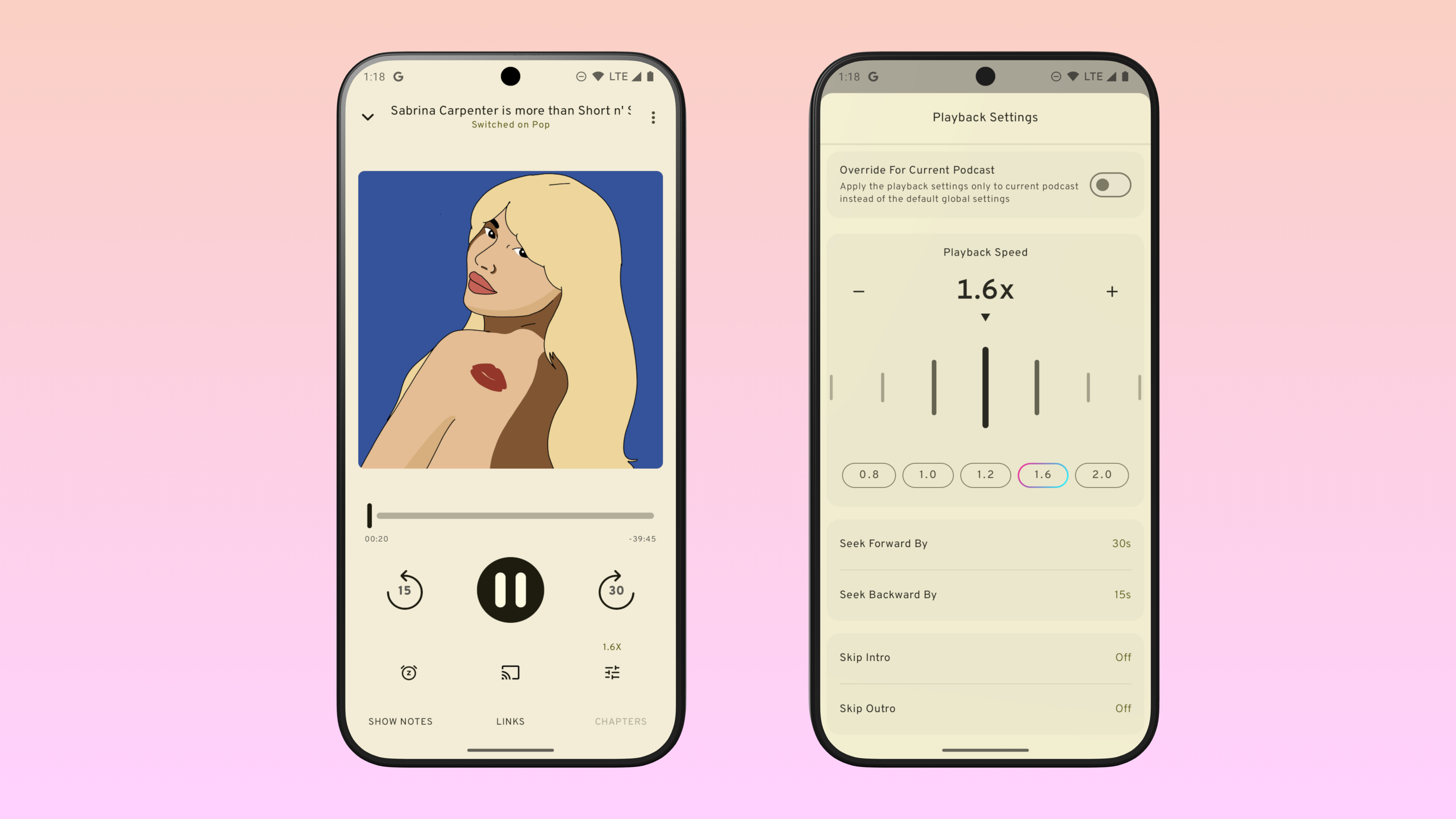
You can see this control in action in my podcast app miaocast.
Inspiration
One of my favorite little details of the now cancelled Google Podcast App is the slider used to adjust playback speed:
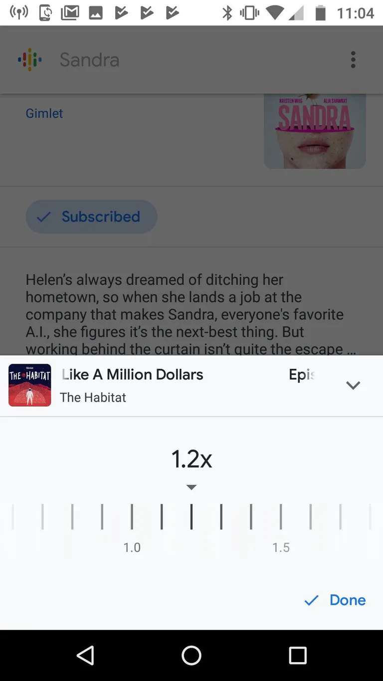
Just like a regular Slider, user can drag the “Bars” left and right to adjust
the speed, but the larger drag targets and custom look makes it stands out.
Let’s see how we can implement this in Jetpack Compose.
Setup
First some basic code to set up this custom control:
// Helper function to format the speed value
private inline val Int.formatted: String
  get() = String.format(locale = null, format = "%.1fx", this / 10f)
// A triangle indicator placed below the current speed text
@Composable
private fun TriangleIndicator(
modifier: Modifier = Modifier,
color: Color = LocalContentColor.current
) {
// Set aspect ratio to 1.155f so that the triangle is an equilateral triangle
Box(
modifier = modifier
.aspectRatio(ratio = 1.155f)
.drawWithCache {
val path = Path().apply {
moveTo(x = 0f, y = 0f)
lineTo(x = size.width, y = 0f)
lineTo(x = size.width / 2, y = size.height)
lineTo(x = 0f, y = 0f)
close()
}
onDrawBehind {
drawPath(path = path, color = color)
}
}
)
}// A custom slider implementation that uses vertical bars as steps:
@Composable
fun SpeedControl(modifier: Modifier = Modifier) {
// We use int here to make calculating easier even though the speed value
// range is between [0.8f, 3f].
// In a real application, this will be provided by the caller along with a
// callback to set the updated value.
var speed by rememberSaveable { mutableIntStateOf(10)}
val color = LocalContentColor.current
Column(
modifier = modifier,
horizontalAlignment = Alignment.CenterHorizontally,
verticalArrangement = Arrangement.spacedBy(8.dp)
) {
Text(text = speed.formatted, style = MaterialTheme.typography.displaySmall)
TriangleIndicator(modifier = Modifier.width(12.dp), color = color)
// TODO: implement the speed dial by drawing vertical bars for each value
// and add drag gesture.
Box(
modifier = Modifier
.fillMaxWidth()
.height(96.dp)
.border(width = 1.dp, color = color)
)
Row(
modifier = Modifier.fillMaxWidth(),
horizontalArrangement = Arrangement.SpaceAround
) {
val speedPreset = listOf(8, 10, 16, 20, 30)
speedPreset.forEach { preset ->
Button(onClick = { speed = preset }) {
Text(text = preset.formatted)
}
}
}
}
}With this set up, we get the basic structure of the control:
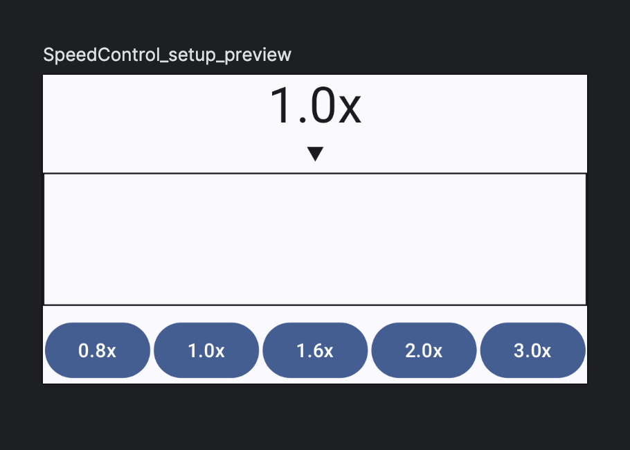
Now we just need to fill in the Box.
Draw the slider bars
We can start by drawing the vertical bars in the box. Each vertical bar represents a
value in the range. So, if the supported value range for our custom slider is
8..30 with 1 increment between steps, we can draw the bars with the
drawWithCache modifier :
@Composable
private fun SpeedBars(
valueRange: IntRange,
modifier: Modifier = Modifier,
color: Color = LocalContentColor.current
) {
Box(
modifier = modifier.drawWithCache {
val strokeWidth = 6.dp.toPx()
val gap = 48.dp.toPx()
val height = size.height * 0.9f
onDrawBehind {
var start = 0f
for (v in valueRange) {
val startOffset = Offset(x = start, y = (size.height - height) / 2)
drawLine(
color = color,
start = startOffset,
end = startOffset.copy(y = startOffset.y + height),
strokeWidth = strokeWidth,
cap = StrokeCap.Round,
)
start += gap
}
}
}
)
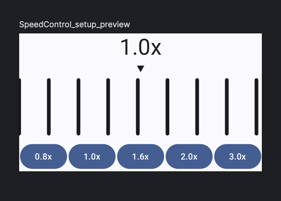
}Once we replace the placeholder Box in SpeedControl, we get this UI:
Make things look nicer
At the moment, the UI looks a bit bland and it’s hard to tell which bar represents the current value. To make the current value stand out, we can adjust the height and color of the bar base on how close the value they represent are to the current value:
val distance = (v - currentValue).absolute.coerceAtMost(5)
val scale = (1f - (distance/5f)).coerceAtLeast(0.5f)
With this, the scale value will be:
1ffor current bar0.8ffor bar that is 1 step away from current bar0.6ffor bar that is 2 steps away from current bar0.5ffor all other bars
We can now adjust the bar base on this scale value:
for (v in valueRange) {
  val distance = (v - value).absoluteValue.coerceAtMost(5)
  val scale = (1f - distance / 5f).coerceAtLeast(0.5f)
  val height = size.height * 0.9f * scale
  val startOffset = Offset(x = start, y = (size.height - height) / 2)
  drawLine(
    color = color.copy(alpha = scale),
    start = startOffset,
    end = startOffset.copy(y = startOffset.y + height),
    strokeWidth = strokeWidth,
    cap = StrokeCap.Round,
  )
  start += gap
}
Now the bars looks like:
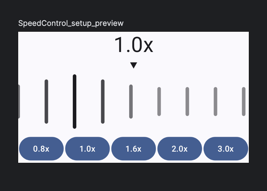
However, it now becomes obvious that we have an issue with the code: the current bar should be centered and placed directly below the triangle indicator.
To fix this, we need to apply an offset when we draw the bar. To see what the offset is, we can draw some vertical guide lines:
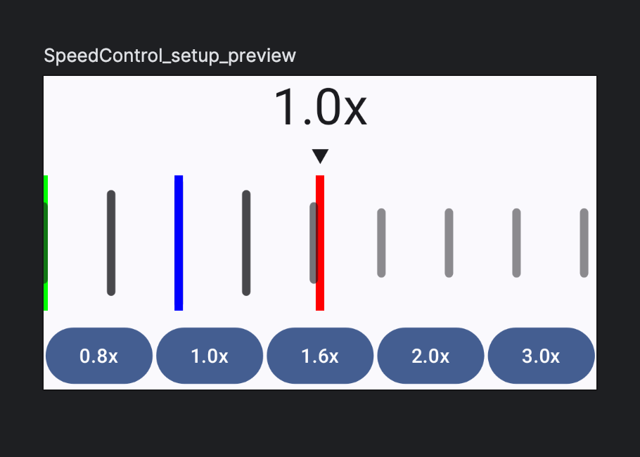
The offset we need to apply to the bars are the distance between the blue line (the current bar) and red line (the center of the box), and we can get that value by doing:
// The distance between the green line and the blue line
val currentBarOffset = gap * (value - valueRange.first)
// The distance between the blue line and the red line
var offset = size.width / 2 - currentBarOffset
@Composable
private fun SpeedBars(
value: Int,
valueRange: IntRange,
modifier: Modifier = Modifier,
color: Color = LocalContentColor.current
) {
Box(
modifier = modifier.drawWithCache {
val strokeWidth = 6.dp.toPx()
val gap = 48.dp.toPx()
val currentValueOffset = (value - valueRange.first) * gap
val offset = size.width / 2f - currentValueOffset
onDrawBehind {
// Instead of starting at 0, we start at offset
var start = offset
for (v in valueRange) {
// Omitted ...
}
}
}
)
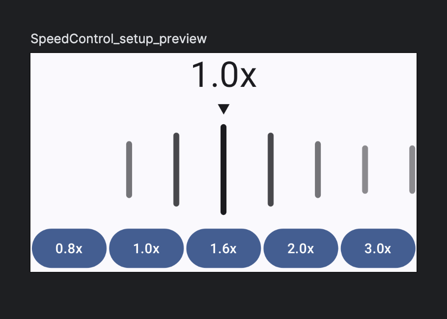
}Now the current value is placed correctly in the center of the Box:
Add drag gesture
Compose offers many APIs to add gestures to a composable but for our use case,
anchoredDraggable fits the bill perfectly.
From the anchoredDraggable doc:
Enable drag gestures between a set of predefined values.
For each bar, we can associate it with an offset that should be applied when the current value is set to the value it represents. From previous section, we already learned that to place the bar at the center, it need to be offset by the distance between its “natural” position if we lay them out from the start of the box and the center of the box. And the formula for that is:
val offset = size.width / 2 - (value - valueRange.first) * gapTo start, we need to create an instance of AnchoredDraggableState that maintains the state of the draggable container, including the current offset, current value and target value:
  val density = LocalDensity.current
  val anchoredDraggableState = remember(density) {
    AnchoredDraggableState(
      initialValue = speed,
      // How much distance need to be dragged between two anchors to trigger
      // an update to the target value.
      // For example, if we anchors A and B are 100px apart, and the current
      // settled position is at A, then this setting will update the target
      // value to B if we drag the container over 10px towards B.
      positionalThreshold = { it * 0.1f },
      velocityThreshold = { with(density) { 100.dp.toPx() } },
      animationSpec = tween()
    )
  }
Then, we need to map each value within the range to an offset. Because the offset
depends on the size of the container, we need to wait until the layout phase to
call updateAnchors to set the offset for each anchor and we can do that use
the built in onSizeChanged modifier:
val density = LocalDensity.current
val gap = with(density) { 48.dp.toPx() }
Box(
  modifier = modifier
    .onSizeChanged { size ->
      anchoredDraggableState.updateAnchors(
        DraggableAnchors {
          valueRange.forEach { value ->
            val offset = size.width / 2f - (value - valueRange.first) * gap
            value at offset
          }
        }
      )
    }
    .anchoredDraggable(
      state = anchoredDraggableState,
      orientation = Orientation.Horizontal
    )
    .drawWithCache(...)
)
This ensures that if the size of the container changes, the anchors are updated accordingly.
Update speed value
To reflect the current value, we need to update the speed state base on the
drag state:
LaunchedEffect(anchoredDraggableState) {
  // Use targetValue so that the text label is updated immediately when
  // drag is detected and not until the drag is settled
  snapshotFlow { anchoredDraggableState.targetValue }
    .collect { speed = it }
}
In a real application, speed will be stored external such as user’s settings.
If you try dragging the SpeedControl now, the speed and position of the bars
will be updated. However, the scale of the bar does not change until the drag is
finished and the anchor has settled to the final target value. That works,
but is not ideal.
To update the bar while drag is happening, we need to consider the progress of
drag gesture. AnchoredDraggableState provides a progress value that is between
0f and 1f depending on how close we are to the target anchor. We can use this
to tweak the formula we used to calculate the distance between the bar’s value
and the “current” value:
val currentValue = with(anchoredDraggableState) {
  currentValue + (targetValue - currentValue) * progress
}
onDrawBehind {
  var start = offset
  for (v in valueRange) {
    val distance = (v - currentValue).absoluteValue.coerceAtMost(5f)
    // Omitted ...
  }
}
Now the bars will grow/shrink/fade as you drag the bar around.
Another bug we have now is that clicking on the buttons does not update the
speed bars, to fix this, we need to update the anchoredDraggableState instead of
speed directly:
Row(
  modifier = Modifier.fillMaxWidth(),
  horizontalArrangement = Arrangement.SpaceAround
) {
  val coroutineScope = rememberCoroutineScope()
  val speedPreset = listOf(8, 10, 16, 20, 30)
  speedPreset.forEach { preset ->
    Button(
      onClick = {
        coroutineScope.launch {
          anchoredDraggableState.animateTo(targetValue = preset)
        }
      }
    ) {
      Text(text = preset.formatted)
    }
  }
}
Final polishes
Haptic feedback
To provide user some haptic feedback when the speed value is changed, we can
use LocalHapticFeedback:
val hapticFeedback = LocalHapticFeedback.current
LaunchedEffect(anchoredDraggableState) {
  snapshotFlow { anchoredDraggableState.targetValue }
    .collect {
      hapticFeedback.performHapticFeedback(HapticFeedbackType.LongPress)
      speed = it
    }
}
Label text
One minor UI glitch I noticed is that when clicking the button, the text label is updated immediately while the bars are scrolling. This can be pretty obvious if we slow down the animation:
  val anchoredDraggableState = remember(density) {
    AnchoredDraggableState(
      initialValue = speed,
      positionalThreshold = { it * 0.1f },
      velocityThreshold = { with(density) { 100.dp.toPx() } },
      // Set durationMillis to 5 seconds
      animationSpec = tween(5000)
    )
  }
We can fix this by observing the current anchor of the anchoredDraggableState
instead of targetValue:
LaunchedEffect(anchoredDraggableState) {
  snapshotFlow {
    with(anchoredDraggableState) {
      anchors.closestAnchor(offset)
    }
  }
    .filterNotNull()
    .collect {
      hapticFeedback.performHapticFeedback(HapticFeedbackType.LongPress)
      speed = it
    }
}
Viola!
Less vibration
To avoid vibrating the device multiple times while the animation is running, we can use debounce to rate limit how often we perform haptic feedback:
LaunchedEffect(anchoredDraggableState) {
  val speedFlow = snapshotFlow {
    with(anchoredDraggableState) {
      anchors.closestAnchor(offset)
    }
  }.filterNotNull()

  launch {
    speedFlow.collect { speed = it }
  }

  launch {
    speedFlow.debounce(timeoutMillis = 100).collect {
      hapticFeedback.performHapticFeedback(HapticFeedbackType.LongPress)
    }
  }
}
Now the haptic feedback will be performed multiple times if the user drags the slider around slowly but only once when clicking the button to set to a specific value.
Final thoughts
It’s amazing how Compose make implementing such a custom control possible with under 200 lines of code (including imports). Can’t imagine how complicated this would be in View land and is the exactly why I’m a big fan of Compose.
The current implementation is functional but not perfect. In future posts,
we will learn how to use semantics modifier to make this custom control more
accessible and add animation to the text label when speed changes.
Stay tuned!
You can find the complete code for this control on Github.